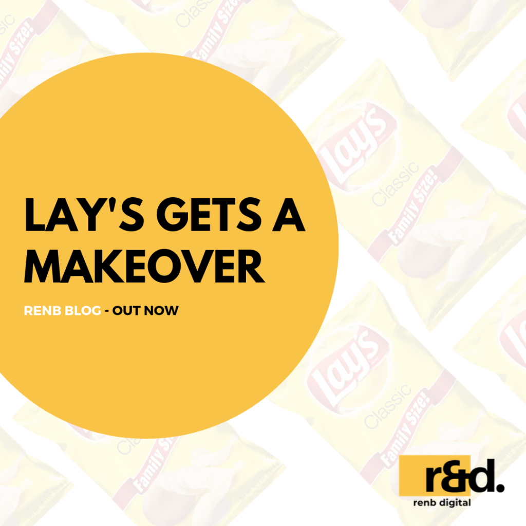
Some brands are just family. Lay’s is one of those brands. The well-known chips and crisps brand have packaging designs that are seared into our brains. You see it at your local kiraana or grab it subconsciously during your supermarket run. If someone opens a packet of Lay’s in front of you (no matter how much air they fill it with) chances are you’ll reach out to grab a chip.
The brand built this recall over a decade of familiar packaging, photography, and print. But they’re about to shed that look and do something new.
For the first time in 12 years! Lay’s is about to change the way their packaging looks. Social Media has been buzzing about this sudden shift. The package now has monochromatic rings in the background. The logo size has been reduced, to give more focus to food photography.
Ironically, they have gone for a ‘Flat Lay’ theme – (no pun intended, or maybe we do). The bag of chips now has a typical blogger-inspired picture of the chips and potatoes layering its sides.